top of page

The Problem:
A local grassroots organization expanded their outreach work during the pandemic, and opened more free food distribution stations around the
San Francisco Bay Area.
Patrons felt frustrated that there was no place on the website to easily look up distribution sites, check to see what hours the stands would be open, or check for closures during severe weather warnings.
Many patrons also weren't familiar with some of the fruits and vegetables at the stand, or how to cook them.

The Goal:
The website needed to be restructured so that patrons would be able to navigate it with more ease.
A schedule page, and a recipe blog needed to be added to the website.


Understanding the User
I set up a series of interviews with the volunteers who work with Indigenous Permaculture, and people who pick up produce from the food tables on a regular basis.
The volunteers wanted people who viewed the website to be able to look up a schedule, easily access the resource links, and be able to sign up for volunteer opportunities or the environmental leadership training program.
The food table patrons wanted to be able to check for severe weather closures, and wanted resources about how to use their produce after picking it up.


Identifying Areas for Improvement
Next, I examined the existing website. I made notes about which pages had useful content, which pages could be grouped together, and the areas of the website which were in need of improvement.


-
Web content was not formatted to fit a mobile phone screen. Most of the patrons who access the free food tables depend on their phones for internet access.
-
Color scheme was inconsistent across pages.
-
Some text colors did not meet Web Accessibility Standards.
-
There were 16 sub menus hidden among the 6 main menus.
-
Content was organized poorly and grouped together in ways which weren't intuitive to users.
Beginning the Design
Ideation
User Goals:
-
Be Able to look up schedule and special events
-
Find volunteer opportunities
-
Sign up for training program
-
Learn about company's history and mission statement
-
Access resource library
-
Learn how to cook new produce

Digital Wireframes:

I worked on finding ways to reorganize the existing content in a more intuitive navigation bar. The homepage needed to prominently display the non-profit's mission statement and photos of their work. Users wanted to be able to easily locate and read the weekly schedule.
Low-fidelity Prototype:


Refining the Design

Users thought that a calendar view would be difficult to read, and that the buttons for selecting individual days to view were too small to click, so I simplified the schedule to a weekly list of events.

I reorganized page layouts so content was more organized, and drop down menus were no longer needed. The recipe blog was moved out of “Resources” and given a direct link.
Sitemap
One of the biggest problems I faced on this project was reorganizing the site’s information architecture. After two decades of outreach work, Indigenous Permaculture had collected some very important resources, and displayed a lot of history on their website. My goal was to restructure the content so that it would be easier for users to find and access the information.
Original Information Architecture

Restructured Information Architecture

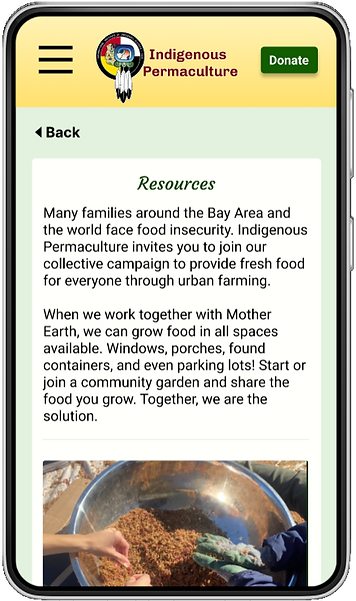
Mobile Mockups


High-Fidelity Prototype

Desktop Mockups


Going Forward
Impact:
People who live in the communities that Indigenous Permaculture serves can now easily find free food tables, check for when bad weather impacts distribution, learn how to become a volunteer, and access resources on how to garden, reduce their energy waste, and how to cook new vegetables.
What I learned:
-
How to advocate about the importance of web accessibility guidelines for font color.
-
How to restructure web content in way that is intuitive to users.
-
How to collaborate on a UX project

Let's Connect!
Thank you for reviewing my work on the improvements to the Indigenous Permaculture website!
If you would like to see more, or get in touch, my contact information is below:
Email: SarahERosencrans@gmail.com
bottom of page
